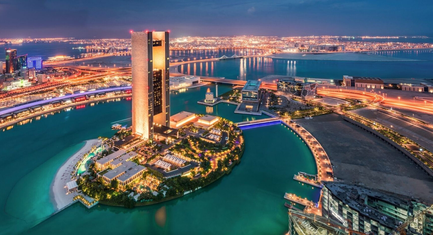
Hero pre-title
The hero component should be used at the top of the page

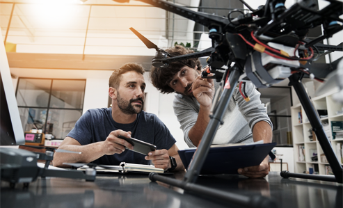
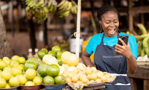
The component is named ‘Image & text columns’ with default options. The options include:
- Image alignment (left / right)
- Border above text (none, medium, full width)
- Text column width (5 column / 6 column)
- Text column vertical alignment (top / centre)
- Hide image on mobile
It also has vertical spacing parameters for both desktop and mobile to add some top and bottom margins.
Text – single column
This component is quite straightforward, and has just options for the upper and lower margins on both desktop and mobile. As with many of these components, text styling is done via the WYSIWYG editor. For example:
Heading 3 style
- List item one
- List item two
- List item three
Videos can also be embedded inline:
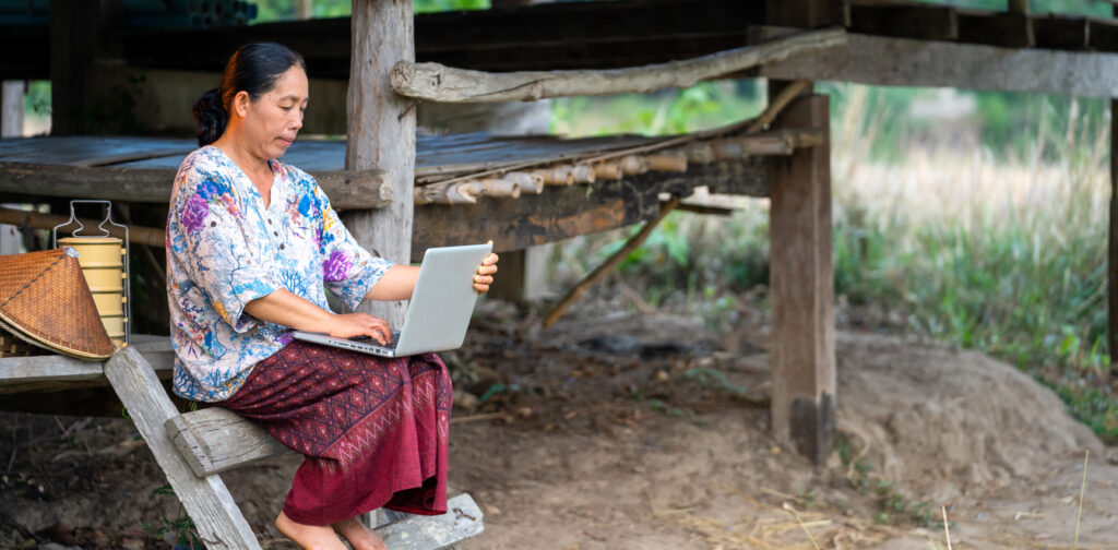
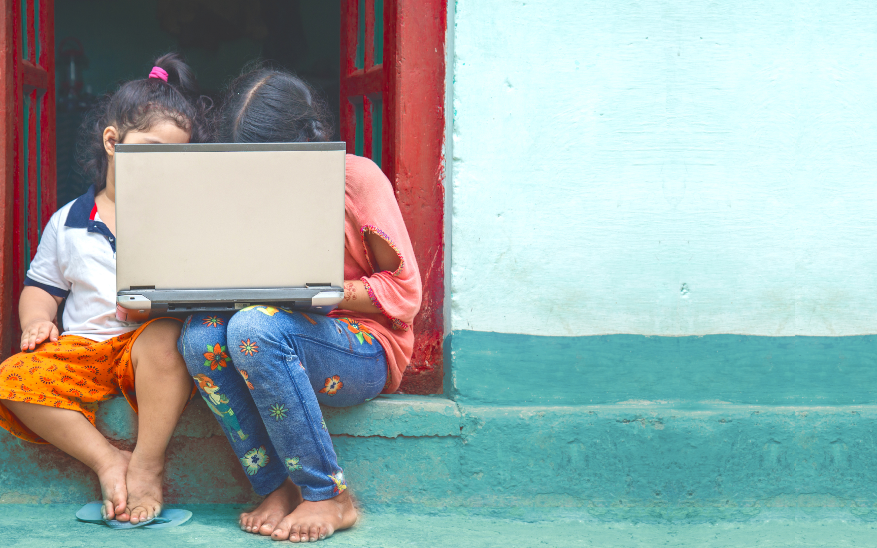
Image & text squares
This component is currently only used on the about page. The images are in a square dimension and the text is centred vertically. The only option is whether the image is aligned to the left or the right.
Text – two columns
The blue line above has been included via the divider shortcode.
This component has a layout select dropdown, with three options:
- 5 column / 6 column
- 4 column / 7 column
- 2 column spacer / 4 column / 4 column
It also has several other options:
- Show blue line above the left column heading
- Enlarge paragraph text in the left column
- Enlarge paragraph text in the right column
- Vertical spacing for upper and lower margins
In this example, the left columns paragraph is set to be enlarged whereas the right column paragraphs are at the default size. The option to have a blue line above the left column heading has not been set.
Text – caption & column
This component has a caption to the left, which relates to the image above, and a single column of text. If you don’t need the caption, it is probably best to use the “text – single column” component.
You can add in all the usual text styling here, including button and divider shortcodes and embedded images and videos. When embedding an image, such as the one below, choose the large size (1010px) as this will fill the column on larger screens.